Yummy Moo 优米恩
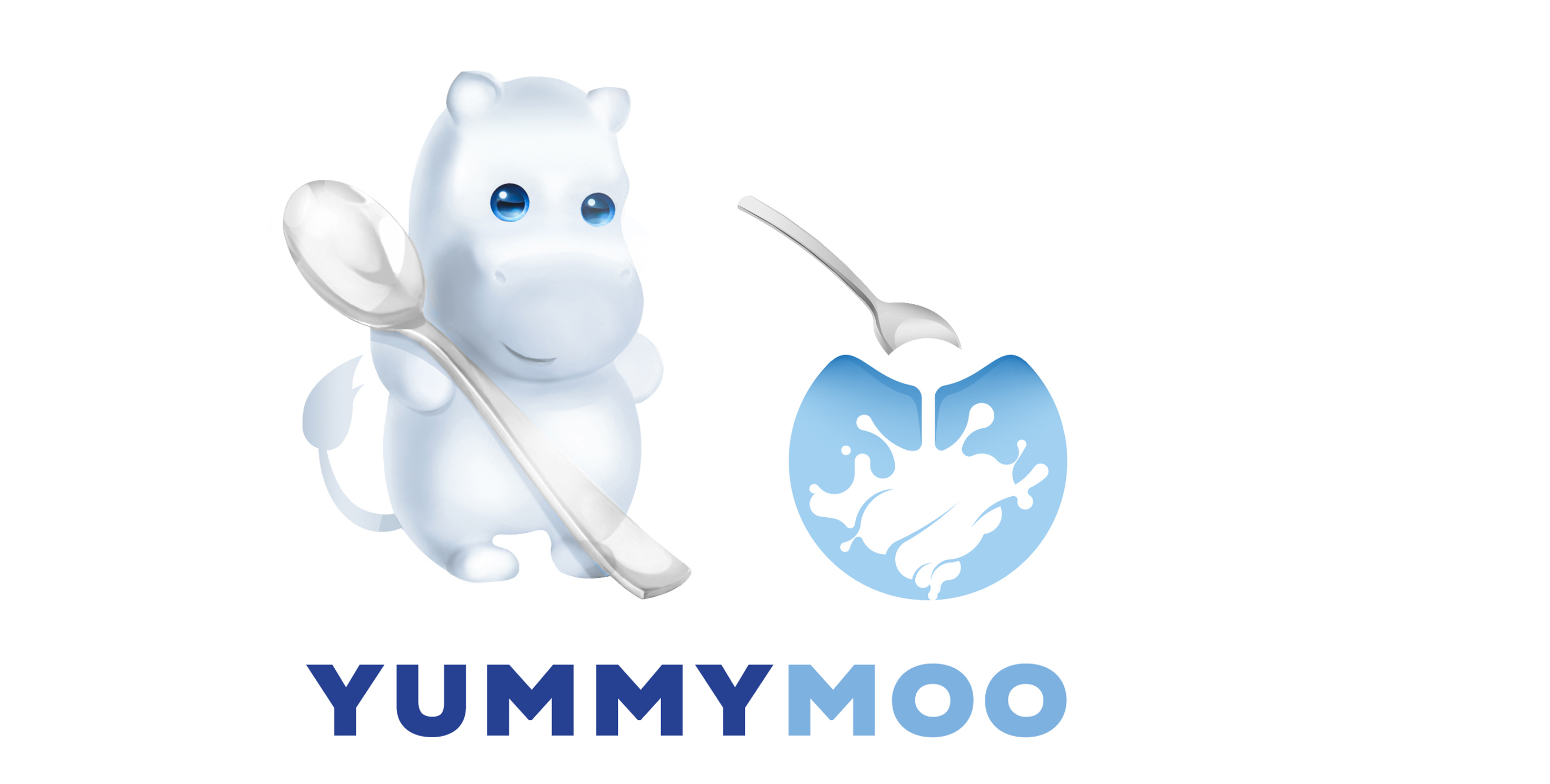
Product name, logotype and mascot design for the formula milk brand in China
The first stage of the project was to develop a name which would work for European and Chinese customers. After a number of researches and focus groups Yummy Moo has been chosen, and I moved to designing a visual identity for the brand.
Hippo became a central point of the visual identity, for its friendly rounded curves and recognisable features. A cloud silhouette and rounded font are aimed to contribute the idea of safety, care and purity of a newborn. Here are a few options:

